Problem: How to visualize your brand identity?
Learning objective 1: Elements of visual brand identity
what is corporate
visual identity?
1.
what's a good logo?
The best logo in the world doesn't work if it can't be reproduced.
2.
the power of type!
3.
show off your colors!
4.
a slogan, why?
5.
what's a
supergraphic?
1. Choose the right brand name
Even though naming isn’t technically part of the visual design process of brand identity, the brand name should still be considered a visual element. A strong brand name shouldn’t just sound right and be easy to pronounce; it should look right too. Even if you hire a gifted design team, a poor brand name can eliminate the opportunity for a successful visual brand identity.2. Create a consistent visual style
All of the brand elements should follow a consistent visual style throughout. If, for example, a decision is made to design a brand identity that is visually romantic and endearing, then this style should be applied to all visual elements. Exceptions can be made for advertising campaigns, but the overall brand identity should always be uniform. This is why visual style guides are always a vital deliverable as they help maintain consistency. Here's a visual style guide I created for Rare Obsession.3. Develop a compelling logo
The logo is the flagship image of any brand. Logos can quickly speak volumes about your business, your mission and what services you offer. An enterprise without a logo has no chance of making an impact on its target audience. The logo is the most essential and valuable visual element of your brand, so keep this in mind when allocating your branding budget and hiring professionals. Below is the logo I designed for Lions & Lambs.
4. Pay attention to color
Colors can play an integral role in brand recognition and brand loyalty. They influence our emotions and help us distinguish between competing brands. Having acknowledged this, considerable research should be carried out before deciding on a final brand color or palette. Cadbury’s, the UK based confectionery producer, considers their own brand color so important to their identity that they went as far as copyrighting their "Cadbury Purple," or Pantone 2685C as it is more commonly known.5. Select appropriate typography
Typography concerns the style and appearance of any lettering or fonts used as part of your visual brand identity. These characteristics can have a significant influence over people’s purchasing decisions and help to further emphasize the message of your brand. Typeface and font choice can affect whether the right message is being communicated and these should conform to the overall visual brand style. Wrong choices can be disastrous, for example a playful font such as the ever-popular Comic Sans would not be suitable for a serious brand image. Gareth
Hardy is a British brand identity designer with a wealth of experience
in delivering revolutionary branding solutions. Working under the
tongue-in-cheek moniker of Down With Design, Gareth has worked for
clients both domestically and internationally, of all sizes and from a
variety of industries. In 2011 he wrote the successful book, Smashing
Logo Design (Wiley), which covers design theory and the techniques
needed to build great logos.
Gareth
Hardy is a British brand identity designer with a wealth of experience
in delivering revolutionary branding solutions. Working under the
tongue-in-cheek moniker of Down With Design, Gareth has worked for
clients both domestically and internationally, of all sizes and from a
variety of industries. In 2011 he wrote the successful book, Smashing
Logo Design (Wiley), which covers design theory and the techniques
needed to build great logos.https://www.waveapps.com/blog/visual-brand-identity-design/
Images are often the first elements of communications people notice,
and it’s important that NMSU branded communications have a uniform,
readily identifiable look.
Below are NMSU brand’s key visual elements. Follow the links for more information about the visual elements.
Official Logos — NMSU’s distinctive logo, and other marks, serve as central pieces of our visual identity. They unite and impart credibility to NMSU media.
Tagline — NMSU’s tagline (All About Discovery!) quickly communicates to all audiences our proud tradition of advancing academic, personal and professional success.
College, Department and Program logo setup — All departments and offices should use the NMSU logo; by proudly utilizing it within this format, each department, office and unit becomes represented as an integral piece within the university.
Color Palette — The NMSU color palette is an important part of presenting consistent visuals in printed and digital communications.
Branding Bars — Precise use of the NMSU branding bars helps viewers immediately identify the university.
Photography — The use of branded photography in print and digital media quickly conveys to audiences a true picture of our campuses, and the faculty, staff and students who make up the NMSU family.
Typeface — Primarily, NMSU is represented in print by “Rotis”and “Lucida Grande” for digital media. NMSU uses a selection of typefaces from each font family.
brand.nmsu.edu/a-message-from-the-president/visual-brand-elements/
Learning objective 2: What is the process of creating and managing a brand identity?
Staying on top of the visual branding game with a limited budget
By Jennifer Borton, iStock Senior Illustration Manager
Previously published in My Business
We are taught as children not to judge a book by its cover.
However, that lesson doesn’t necessarily apply to business, and
customers will often judge a company by how their brand looks.
Therefore, it is crucial to create a visual identity for your brand that
is appealing to customers and communicates the right messages.
Visual identity plays a key role in the branding strategy of any business, regardless of size or industry. As the visual expression of a brand, it may encompass many design elements such as shape, color, imagery, typography and composition. A consistent style should be identifiable across all visual communications, from print collateral to digital media. Today, to be taken seriously, you need a clean web presence, supported by professional stationery and collateral to help reinforce your visual identity. Once established, this strong identity helps to define your company, set it apart from the competition and encourage brand loyalty.
Invest your visual brand with the same importance that you afforded your business plan. Write a strategy that clearly outlines your ideas and what you want to achieve. Look through your content and pick out the key concepts and themes that appear throughout. Using these ideas as 'keywords,' begin searching for design elements and imagery that reflect them. Bear in mind that imagery should serve as visual breaks for your content that will help the viewer comprehend what's written.
Select imagery that has a unique element, something that will stand out and make your brand memorable, and always match your visual style. So, if you're using an illustration, check to see what else the artist has produced and consider how these visuals could be incorporated into other parts of your site or print collateral. This will give your communications visual cohesion and may even give the impression that you have had your imagery custom created.
Once you have committed to a look and feel, draft a set of guidelines to help ensure that your brand maintains consistency as it grows and evolves. These guidelines should describe your company values and spirit, tone of voice, typography style, photographic or illustrative style, color palette, layouts and so on. Setting these guidelines up front and implementing them across all visual communications will help you avoid ending up with an amateur-looking site or company brochure, that doesn't properly reflect the brand.
As time goes by though, how do you evaluate whether the materials you have are in need of a facelift? Ask yourself: Has it been a long time since you’ve considered your presentation? Do you find yourself scrambling to put something together every time a prospect asks for information? Has your industry changed since your business was established? Is there a lot of competition, and how do competing businesses’ materials compare to yours?
Here are some key illustration trends to inspire and help get the ball rolling when you create the visual identity and collateral for your brand:
Your brand is a reflection of your business, so stay true your company’s core values and what it stands for.
http://www.istockphoto.com/article_view.php?ID=1568

Visual identity plays a key role in the branding strategy of any business, regardless of size or industry. As the visual expression of a brand, it may encompass many design elements such as shape, color, imagery, typography and composition. A consistent style should be identifiable across all visual communications, from print collateral to digital media. Today, to be taken seriously, you need a clean web presence, supported by professional stationery and collateral to help reinforce your visual identity. Once established, this strong identity helps to define your company, set it apart from the competition and encourage brand loyalty.
Invest your visual brand with the importance that you afforded your business plan.
Designing your visual brand
While it is important to think visually, it is essential that you are very clear about the key messages that you are trying to communicate before you start designing.Invest your visual brand with the same importance that you afforded your business plan. Write a strategy that clearly outlines your ideas and what you want to achieve. Look through your content and pick out the key concepts and themes that appear throughout. Using these ideas as 'keywords,' begin searching for design elements and imagery that reflect them. Bear in mind that imagery should serve as visual breaks for your content that will help the viewer comprehend what's written.
Keep it simple
While it ultimately depends on the brand, a cardinal rule of design is that typically, simple is best. A clean, smart illustration will communicate an idea quickly and from a distance. A picture can say a thousand words, so the images you choose will speak volumes about your brand.Select imagery that has a unique element, something that will stand out and make your brand memorable, and always match your visual style. So, if you're using an illustration, check to see what else the artist has produced and consider how these visuals could be incorporated into other parts of your site or print collateral. This will give your communications visual cohesion and may even give the impression that you have had your imagery custom created.
Know your competition
Don’t forget to check out your competition. What are they doing well and what could they improve upon? What other brands (even outside your space) do you admire and why? Are there ways you can emulate what they've done well without being a copycat?Professional creative tools
Many small businesses don’t have the resources to hire design firms or professional photographers to create their content, and instead tend to coordinate this themselves. Creating a cohesive visual identity does not need to be complicated or expensive. You might already be familiar with stock image companies like iStock as a place to go for photos – perhaps stock is already part of your business. What you might not know is that it’s also a great place to go for illustrations, including files that can be used as backgrounds, borders or design components of printed materials.Once you have committed to a look and feel, draft a set of guidelines to help ensure that your brand maintains consistency as it grows and evolves. These guidelines should describe your company values and spirit, tone of voice, typography style, photographic or illustrative style, color palette, layouts and so on. Setting these guidelines up front and implementing them across all visual communications will help you avoid ending up with an amateur-looking site or company brochure, that doesn't properly reflect the brand.
As time goes by though, how do you evaluate whether the materials you have are in need of a facelift? Ask yourself: Has it been a long time since you’ve considered your presentation? Do you find yourself scrambling to put something together every time a prospect asks for information? Has your industry changed since your business was established? Is there a lot of competition, and how do competing businesses’ materials compare to yours?
Key trends
We have been inundated with advertising in so many forms and for so long now that audiences can see through messages that are false, cheesy or insincere. Due in part to the influx of reality-based television, there has been a trend toward reflecting real people and situations in marketing collateral.
Imagery that captures an authentic moment, a slice
of life, is instantly relatable, enabling the viewer to identify with
the message being communicated.
In recent travels to Australia, I noticed that the country has a
particularly illustration-rich culture, with illustrative mediums
ranging from 3D renders to vectors found across advertisements,
invitations, flyers and other marketing materials. This is not
surprising, as the endless adaptability of vectors continue to make them
prime choices for backgrounds, textures and overlays, navigation
elements, banners and decorations. What is changing is the way
illustrations are used, and the styles that are evolving and growing
popular. Reflecting the trend towards authenticity and back-to-basics
sites like Pinterest and SMB marketplace Etsy, people are creating and
utilizing old-fashioned styles – moving away from heavily
computer-generated illustrations.Here are some key illustration trends to inspire and help get the ball rolling when you create the visual identity and collateral for your brand:
- Hand drawn style: The hand-made look is not a new trend, but it will definitely stay strong for the time being. Designers continue to explore the textures of chalk, paint, pen and ink, sketchy lines and brushstrokes on paper backgrounds.
- Organic techniques: The arts and crafts craze is reflected in the growing number of illustrators mixing their tools and techniques – adapting technologies to bring their crafty style onto the screen, rather than having the tools dictate what they can and can't do.
- Print inspired: One particular off-shoot of all this cross-discipline cross-pollination is the trend towards print-inspired graphics. High contrast wood block-inspired slabs of color are paired with rich textures indicative of the pre-digital print era.
- Vintage charm: A versatile trend incorporating pretty patterns, lace and a retro feel.
- Greater detail: As resolutions increase, from the new monitor on your desktop to the screen on your mobile device – designers are taking advantage of the extra pixels.
- Hero vector: We're seeing more and more illustrations front and center, not simply overlaying and supporting other imagery.
Your brand is a reflection of your business, so stay true your company’s core values and what it stands for.
http://www.istockphoto.com/article_view.php?ID=1568
Learning objective 3: examples of visual brand identity
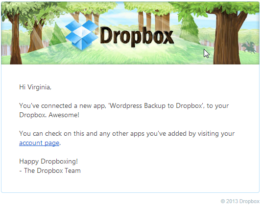
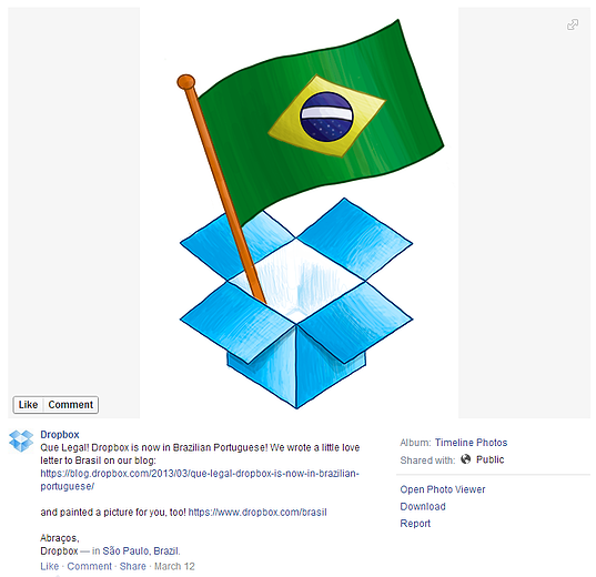
Dropbox already made it onto our list of companies to admire for consistent, stellar branding,
but what makes this company's visual content so awesome is more than
just its consistency. The cloud software file storage and sharing
business uses colored-pencil drawings to showcase its playful
personality. Just take a look at the email and Facebook post examples
pictured below:
While the actual designs themselves aren’t particularly special, it’s the style
of the visuals that makes them brilliant. Bright colors and visible
stroke lines that wobble -- these playful, down-to-earth design elements
make you think a real human is behind Dropbox. Furthermore, associating
these images with Dropbox increases brand recognition whenever someone
sees a similarly styled image online. And since Dropbox is trying to
compete with internet giants like Google, it definitely helps to have
extra compelling, recognizable content to set them apart. These visuals
make Dropbox seem more humanized and user-friendly than its competitors,
all without making use of a single screenshot of the product itself.
http://blog.hubspot.com/marketing/b2b-visual-content-examples
http://memolition.com/2014/07/04/the-best-of-the-worst-logo-designs/
Does
your company have a brand identity that is more than just a logo?
While a logo is a good place to start, you should consider building
your “visual position” to be something larger. Building a system for
your brand allows you to meet the demands of different media, while
still presenting a cohesive identity.
For example, web site design only allows a limited number of font choices, but that doesn’t mean you shouldn’t have a corporate typeface for printed marketing materials. In fact the more elements you can establish as your basic look and feel will mean that variations from that scheme won’t make your brand identity disintegrate.
For example, web site design only allows a limited number of font choices, but that doesn’t mean you shouldn’t have a corporate typeface for printed marketing materials. In fact the more elements you can establish as your basic look and feel will mean that variations from that scheme won’t make your brand identity disintegrate.
- Logo or wordmark. A logo is a graphic symbol, whereas a wordmark or logotype is just the words of your company or product name set in a specific, fixed way. These elements should be professionally designed and set.
- Different logo “lockups”. While your logo should always be rendered consistently, you will need variations based on placement and usage. For example, you may need color and black and white variations, you may need versions for horizontal and square applications. But they all should have the same essential qualities.
Does
your company have a brand identity that is more than just a logo?
While a logo is a good place to start, you should consider building
your “visual position” to be something larger. Building a system for
your brand allows you to meet the demands of different media, while
still presenting a cohesive identity.
For example, web site design only allows a limited number of font choices, but that doesn’t mean you shouldn’t have a corporate typeface for printed marketing materials. In fact the more elements you can establish as your basic look and feel will mean that variations from that scheme won’t make your brand identity disintegrate.
The truth is, that once you start making things, your identity standards are going to be tested.
For example, item #5 (choose a corporate typeface) is not going to be fully applicable on your web site (unless you’re Ikea and choose Verdana for everything). But if you have seven other branding elements that are strongly apparent in the web design, the site will still be able to promote your recognizable brand. If on the other hand, those other graphics are not well-defined and well-used, each application you create dilutes rather than builds a comprehensive brand identity.
- See more at: http://www.visiblelogic.com/blog/2010/04/8-essential-elements-to-a-comprehensive-brand-identity/#sthash.A4Xgh7G4.dpuf
For example, web site design only allows a limited number of font choices, but that doesn’t mean you shouldn’t have a corporate typeface for printed marketing materials. In fact the more elements you can establish as your basic look and feel will mean that variations from that scheme won’t make your brand identity disintegrate.
- Logo or wordmark. A logo is a graphic symbol, whereas a wordmark or logotype is just the words of your company or product name set in a specific, fixed way. These elements should be professionally designed and set.
- Different logo “lockups”. While your logo should always be rendered consistently, you will need variations based on placement and usage. For example, you may need color and black and white variations, you may need versions for horizontal and square applications. But they all should have the same essential qualities.
- Key colors. A corporate color palette is usually defined by the colors in a logo. Often these are one or two colors only, although some are more complex.
- Additional color palette options. In addition to the colors in your logo, what other colors complement them? This can be loosely defined such as: bright and bold, pastel, or cool colors. Or, they may handpicked from a color swatch book. These additional colors are often what really brings together (or makes a disconnect) from one point of contact to the next.
- Corporate typefaces. Choose just a handful of fonts to be used whenever there is printed materials. Make sure these are available on all the computers that will create these documents.
- Standard typographic treatments. Your typographic identity should include ways of handling key types of text, perhaps a consistent way of styling headlines or pull-out text. Work to make these similar from one application to the next. It may be the way you write your URLS, or the way you capitalize your headlines.
- Consistent style for images. You don’t need to use the same photos over and over again, but all imagery should have a consistent look and feel. Maybe the photos are brightly lit and the subject is looking right into the camera. Or, the photos have a subtle color palette and the people never look at the camera but are engaged in their activity. Photos could be close-ups, soft focus, or crisply detailed. You don’t need to use photos! You can use line art, illustrations or just charts and graphs. Whatever you choose, use a consistent style in all materials, whether printed or online.
- Have a full library of graphic elements. These are all the small details that really build a branding system. It could be a background texture, a line style treatment, a use of white space or color blocks. These are the areas where do-it-yourself-ers start to suffer, and where a professional graphic designer can pull together a cohesive look for you.
The truth is, that once you start making things, your identity standards are going to be tested.
For example, item #5 (choose a corporate typeface) is not going to be fully applicable on your web site (unless you’re Ikea and choose Verdana for everything). But if you have seven other branding elements that are strongly apparent in the web design, the site will still be able to promote your recognizable brand. If on the other hand, those other graphics are not well-defined and well-used, each application you create dilutes rather than builds a comprehensive brand identity.
- See more at: http://www.visiblelogic.com/blog/2010/04/8-essential-elements-to-a-comprehensive-brand-identity/#sthash.A4Xgh7G4.dpuf
Ei kommentteja:
Lähetä kommentti